thinkingquantitatively
Thinking Quantitatively Project 5: Climate Change
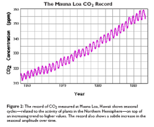
Global warming has received a lot of attention lately, and is now referred to as climate change. The following graphic from Al Gore’s An Inconvenient Truth shows the rise of Carbon Dioxide in the atmosphere as measured at Mauna Loa:
1. The text below the graph indicates that the rise and fall of the line is due to seasonal activity related to the Northern Hemisphere. Explain what this means and why this graphic is literally a display of the Earth “breathing”.
2. Fit a trend-line to this graph using pencil and paper (and a ruler if needed) and compute the equation of the line. Interpret the slope in real world terms.
3. Compute the total change of CO2 from 1960 to 1990, the percent change, and the average change.
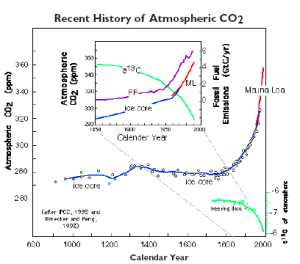
4. The graphic above seems to be indicating a linear increase in CO2. Tacking this graphic onto ice core records of CO2 over the last 1000 years gives us a new perspective in the graphic below. Is it accurate to say CO2 has been increasing linearly over the last millennium? What type of growth is displayed in the graphic below?
The following graphic from a paper[1] by Robinson, Robinson, and Soon (available here[2]) displays the average US Surface Temperatures measured over the 20th century along with a measure of solar activity (sunspot activity among others). These scientists are claiming that temperature variation is correlated with solar activity. Solar activity is measured in Watts per square meter, i.e. energy we receive from the sun per unit area.
[1] “Environmental Effects of Increased Atmospheric Carbon Dioxide” by Arthur B. Robinson, Noah E. Robinson, and Willie Soon (Robinson et al. paper published in Journal of American Physician and Surgeons (2007) 12, 79-90)
[2] http://www.oism.org/pproject/s33p36.htm
5. By how much has the US surface temperature warmed, according to the trend-line given in the graphic, over the last century? What is the percent change?
6. Use the facts that 0C = 32F and 100C = 212F to find the equation of the line between the two points (0, 32) and (100, 212).
7. Use the linear equation to convert your answer from part e to degrees Fahrenheit.
8. Notice the US experienced a warming trend from 1900 to 1940, cooled off from 1940 to 1975, and warmed up again from 1975 to 2000. Ignoring solar activity, sketch a trend-line for US surface temps for each of these three time periods and estimate the equation of each line.
9. Interpret the slopes for each line in real world terms and convert each slope to degrees Fahrenheit per year.
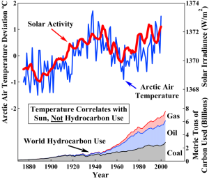
10. The following graphic is similar to the one above but now is correlating arctic air temperature with solar activity. Explain why these scientists feel this graphic is justifying the claim in the box that temperature correlates with the sun and NOT hydrocarbon use.
11. Sea levels have been rising as evidenced by the following graphic. Verify the overall trend of 7 inches per century (estimate the slope), and also verify the intermediate trends of 9, 0, 12, 0, 12 inches per century. Note: The word “verify” requires you to perform a calculation (and write it down for me to see) which computes a slope of the right value over each time period in question. How does this graphic support what these scientists have claimed above?
12. Many other scientists feel that global warming is due to hydrocarbon use. The Intergovernmental Panel on Climate Change (IPCC) was established in 1988 by the United Nations to serve as an advisory board for nations around the world on this topic. The fourth IPCC report was released in February 2007, http://www.ipcc.ch/index.htm , and included the following graphic (on p. 39 of the AR4 Synthesis Report). Explain how this chart indicates hydrocarbon usage and NOT solar activity are causing global warming (you may need to use a dictionary, in particular look up the word “anthropogenic”!).
13. The fourth IPCC report concludes with the following statement (see below). How does the claim in the third sentence, “the linear warming trend over the last 50 years is nearly twice that of the last 100 years”, follow from the second sentence?


Discussion
No comments yet.