I realize now that this title could mean different things after I have typed it in. Here we are talking about the enormous advantage students from wealthy households have in getting into the top colleges and universities. The article, Explore How Income Influences Attendance at 139 Top Colleges, “shows the chances that similarly qualified students — those with the same standardized test scores — have at attending a college based on their parents’ income.” My students were naturally interested in seeing how this played out at their own Bowdoin College, and the article allows for you to enter any of the “top” schools to see their statistics. The line graph featured for this post turned out to be one of the most difficult to interpret of any that I have seen in teaching QR! Consider the following two charts for Bowdoin:


The basic idea seems simple enough, wealthier students (by parents’ income), are more likely to attend top schools than less wealthy students, even with the same scores. The article states: “Considering students with the same score, at Bowdoin, someone from the top 1 percent was 2.7 times as likely to attend as a typical student with that score, while a student from the bottom 20 percent was about half as likely to attend.” How exactly was the 2.7 computed??? In other words exactly what two statistics are we comparing, with one being 2.7 times the second? I’ll let you think about that for a bit.
The next few charts were more straightforward, a basic column chart and dot plot.
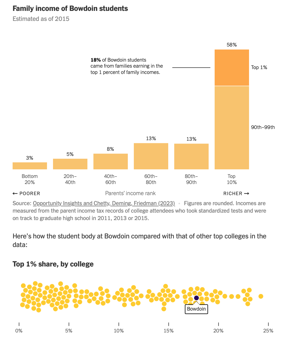
The column chart gives a powerful visual of the privileged status of the majority of students at the top schools considered in the article (not just Bowdoin!). The dot plot puts Bowdoin in relation to other schools, but even this comparison was difficult to articulate for many of my students. It’s a great article to explore in your QR classes. I include my answer to interpreting the line charts in the quiz below. Let me know if you think I missed the mark!
Quiz Income and Admission
- The article, Explore How Income Influences Attendance at Top 139 Colleges, is chock full of graphics for us to interpret!
- Please explain both the 9.6X and 2.7X statistics for Bowdoin from the line charts.
The share of all college-bound students from the top 1% of hshld income who attended Bowdoin is 9.6 times greater than the share of all college-bound students who attended Bowdoin. If we compare the share of all college-bound students with the same test scores, then a student attending Bowdoin from top 1% is 2.7 times as likely as the average student.
This next column chart seems easier. What type of chart is this in Excel? Compute the ratio of the percentage for the Top 10% to the Bottom 80% and use in a meaningful sentence.
- Dot plots! I love dot plots, they seem very bubbly and fun. What is this chart telling us about Bowdoin?
- Please explain both the 9.6X and 2.7X statistics for Bowdoin from the line charts.
- Joel Best discusses how big numbers confuse people.
- Compute how long 1 thousand seconds is in minutes.
- Compute how long 1 million seconds is in days.
- Compute how long 1 billion seconds is in years.
- Compute how long 1 trillion seconds is in years.
- Compute how long 1 thousand seconds is in minutes.
- Complete the following analogy: A penny is to $10,000 as _________ is to $1 trillion. The value you just put in the blank is like a penny to the U.S. government’s budget.

Discussion
No comments yet.